fv
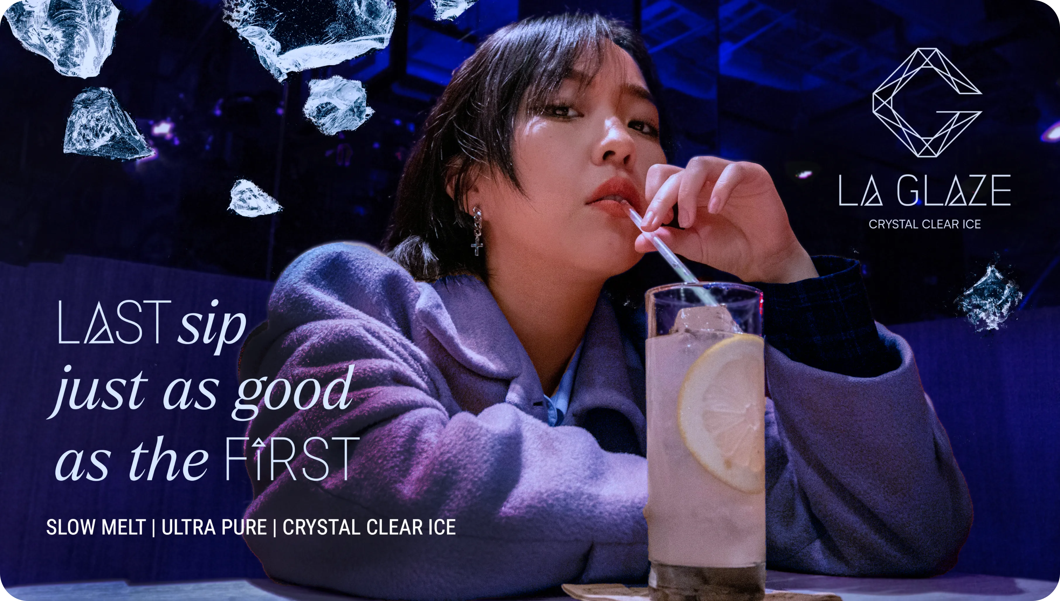
LaGlaze is India’s 1st craft cocktail ice company with in-house technology. The brand blends art and engineering to create premium ice products that enhance customer experience.
The mission at hand
Sophisticated and Elegant Branding:
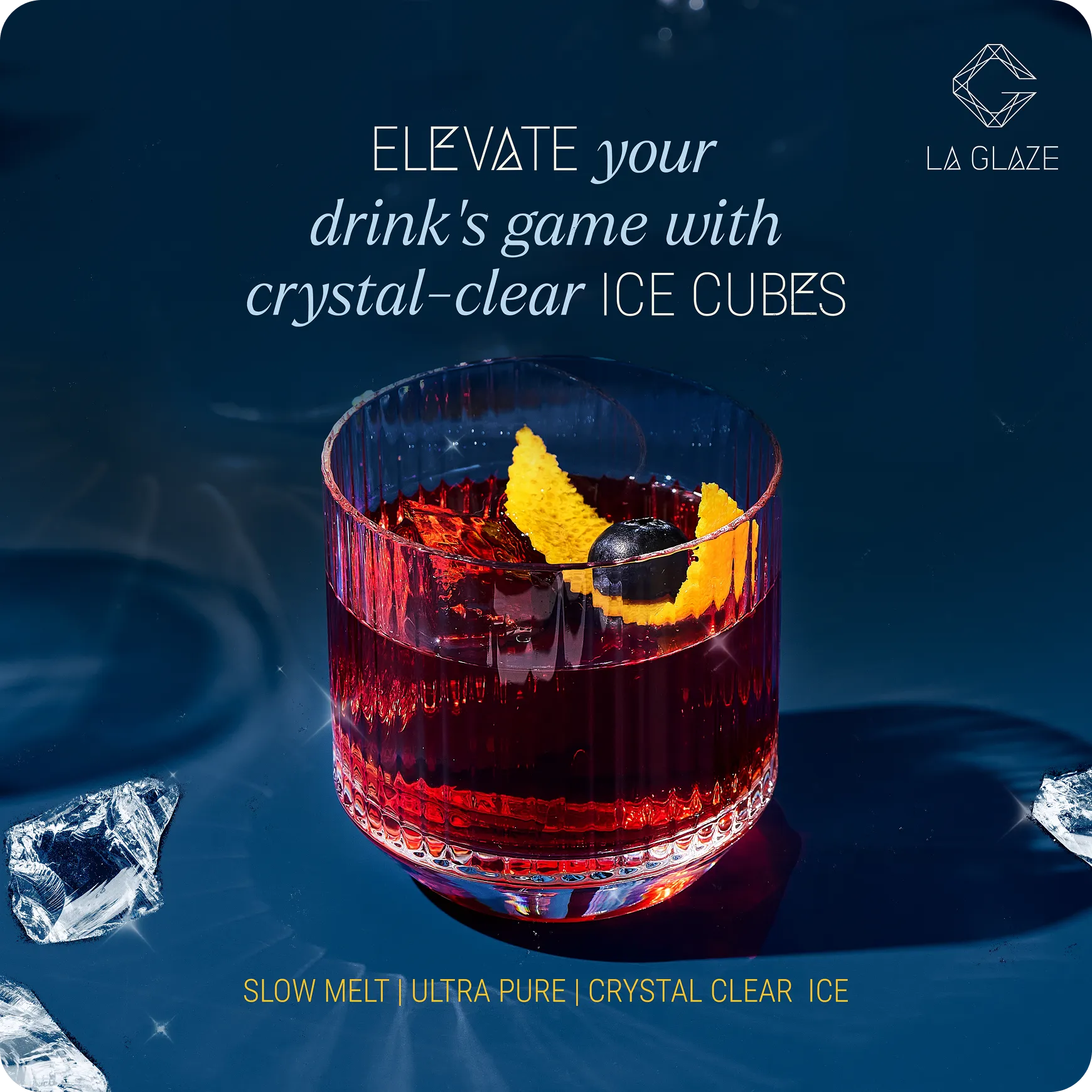
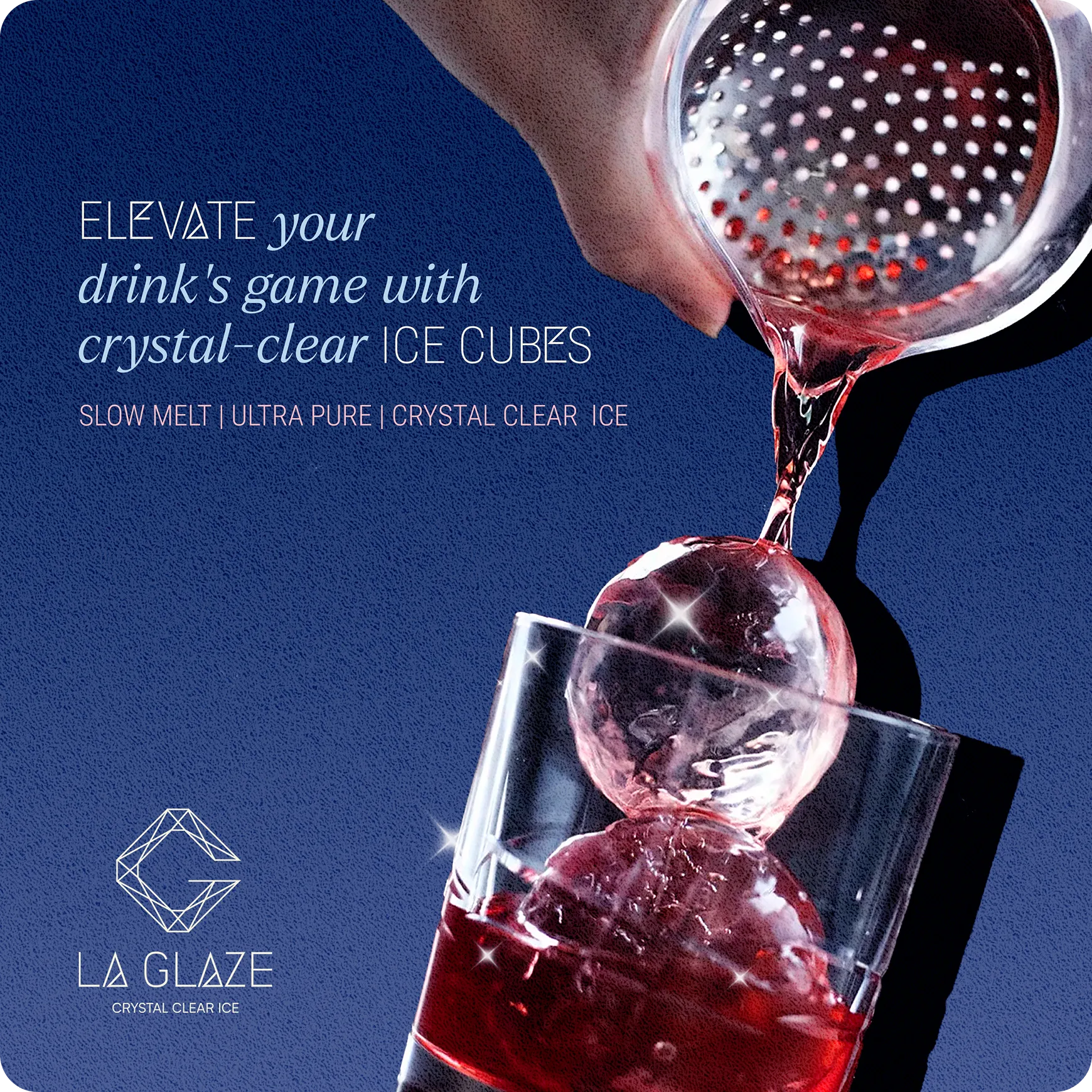
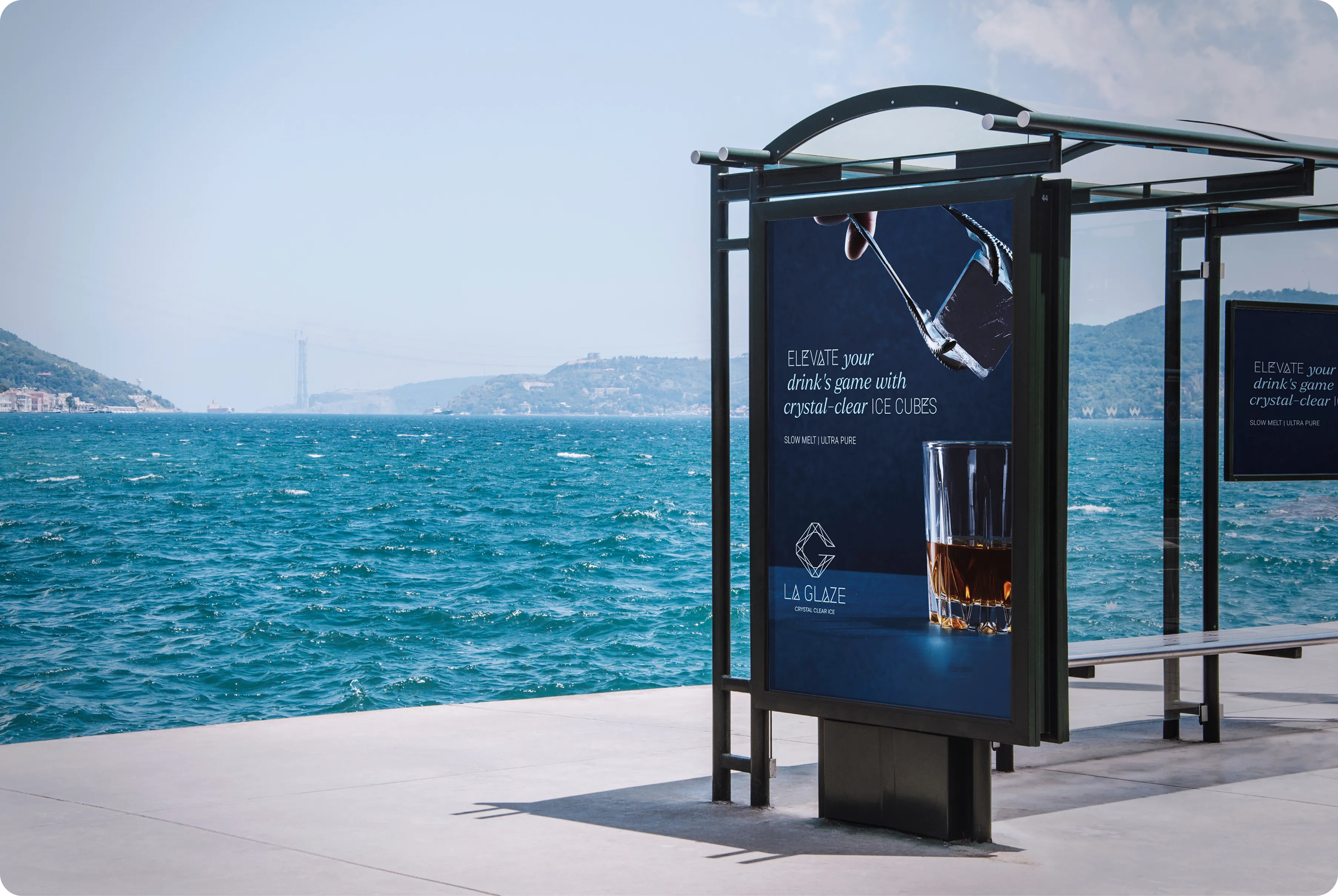
The logo and overall branding needed to exude sophistication and elegance to resonate with the brand’s positioning as a premium product. The design elements should evoke a sense of luxury, precision, and high quality, aligning with the product's benefits of maintaining the integrity of drinks by keeping them cold without dilution.
Packaging Design:
Everything about the packaging, from the design to the materials used, should resonate with an upscale audience. It should convey a sense of exclusivity and luxury, assuring customers that they are purchasing a product of the highest quality. Elements like a sleek design, understated elegance, attention to detail with attractive visuals, will help achieve this.
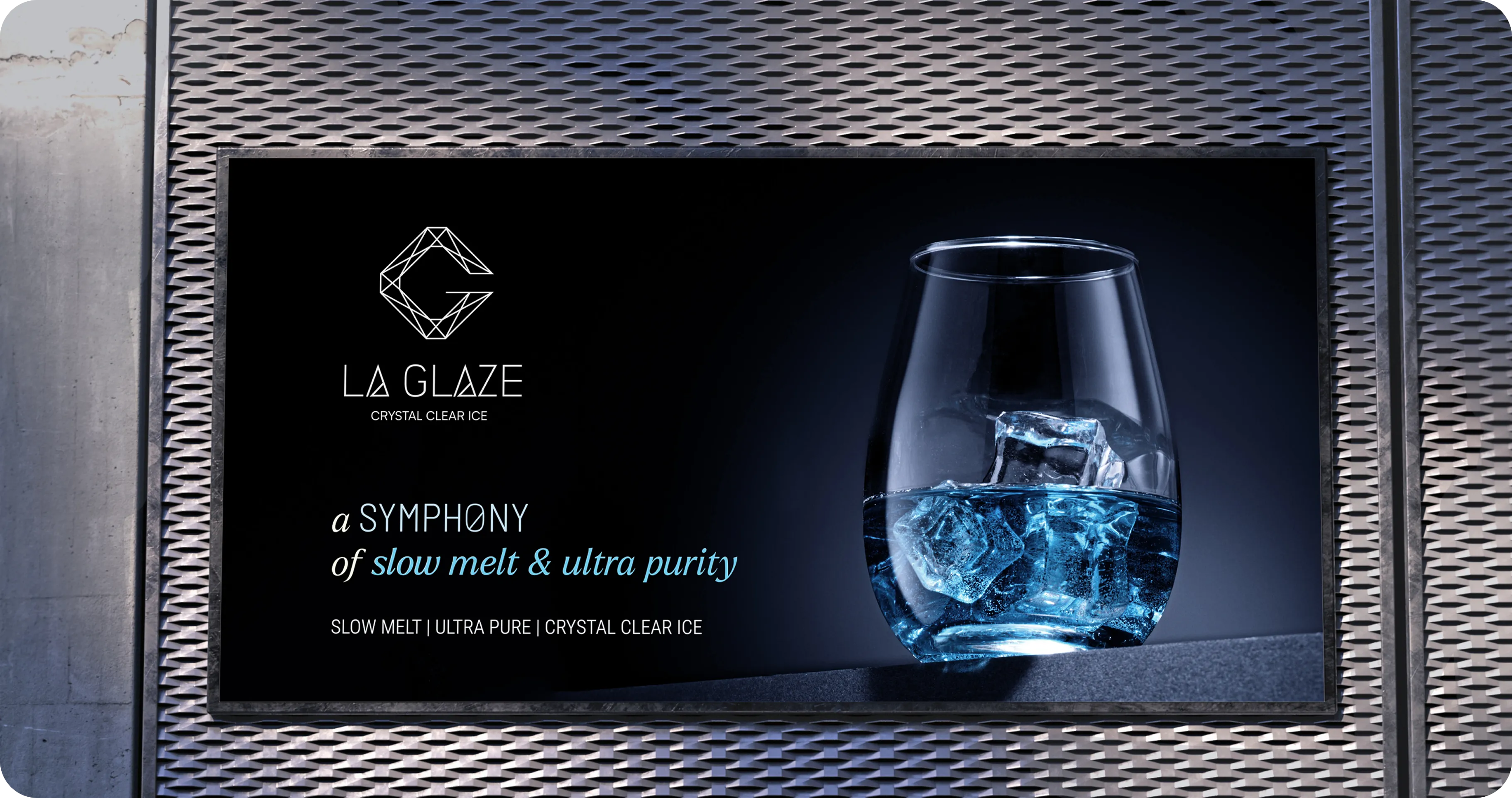
The Motto:
Elevate the drinking experience
with LaGlaze elegant clear ice
The Logo Identity Design
The Inspiration: Crystals
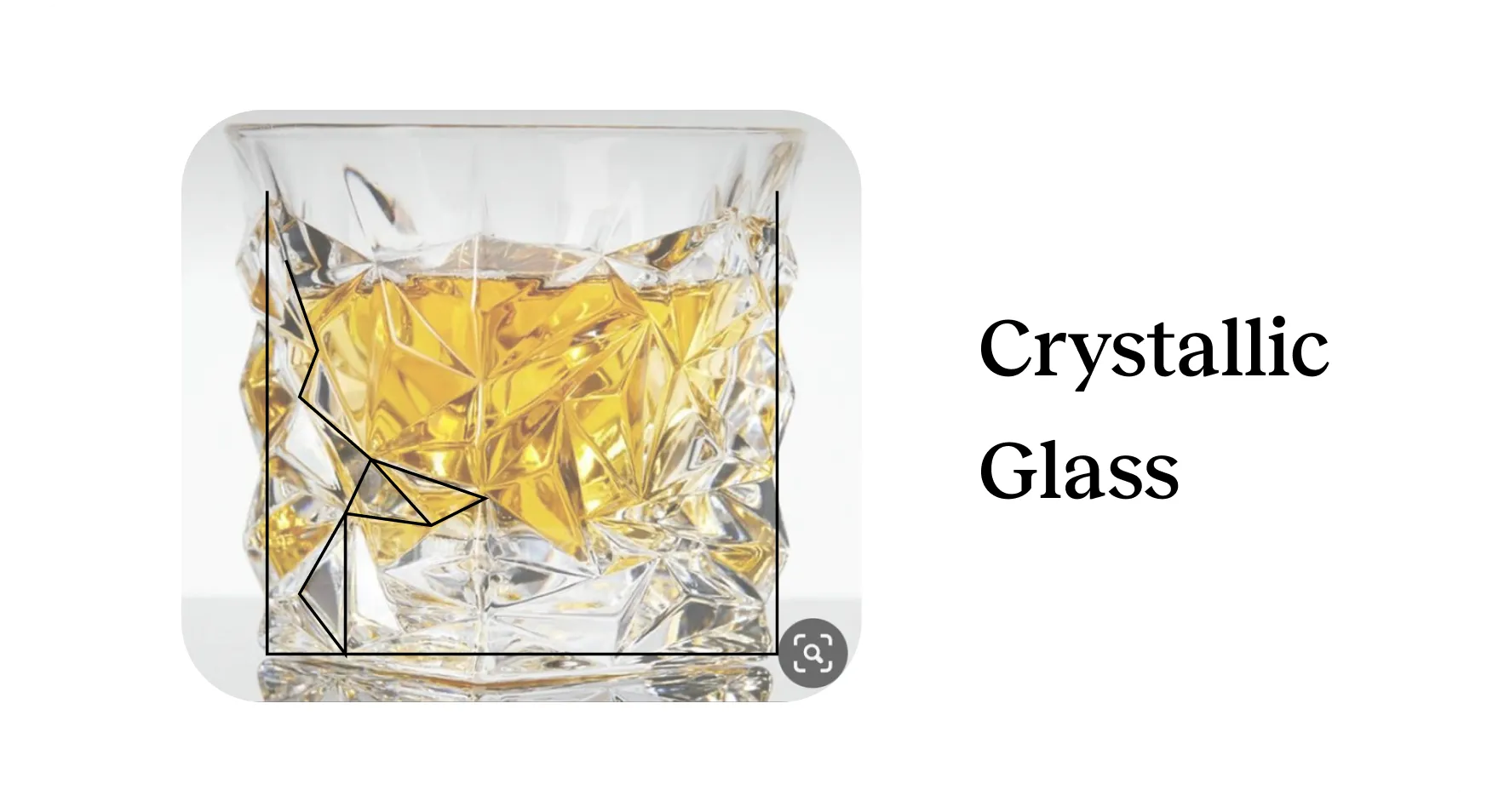
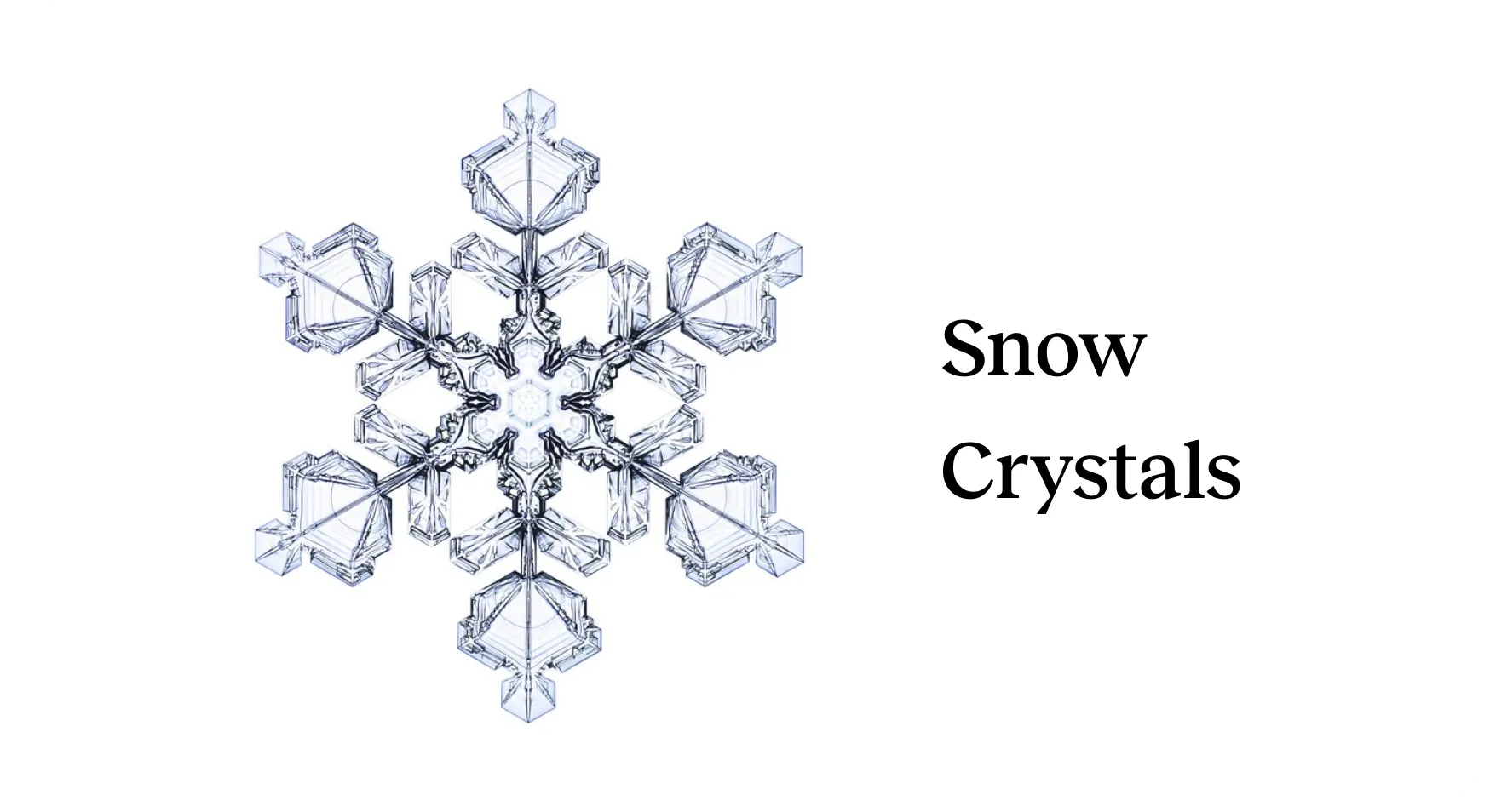
Why Crystals?
-
1. Purity and Clarity:
Crystals often symbolize purity and clarity, which aligns well with the idea of clear ice. This association highlights the quality and transparency of the ice we produce.
-
4. Natural Inspiration:
Since ice can be considered a form of crystal in its solid state, drawing inspiration from crystals connects our product to its natural form.
-
2. Precision and Perfection:
The geometric precision of crystal structures suggests perfection and attention to detail. It conveys a message that LaGlaze is committed to delivering a high-quality and perfectly crafted product.
-
5. Memorability:
Crystal shapes can be distinctive and memorable. Incorporating crystal-inspired elements in our logo can help create a unique and recognizable brand image, making it easier for customers to remember and identify our product.
-
3. Elegance and Sophistication:
Crystals are often associated with luxury and elegance, like diamonds. Using crystal-inspired elements in the logo evokes a sense of sophistication, making our brand stand out as a premium and refined choice in the market.
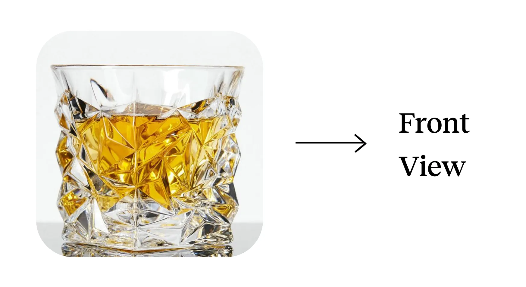
Crystalline Optics + Contours + Letter G + Drinking Glass
How we arrived at it
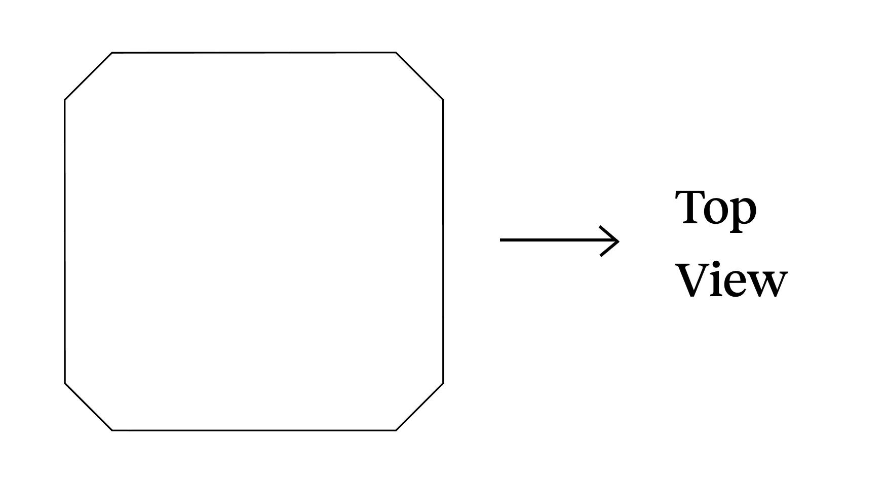
Logo Evolution
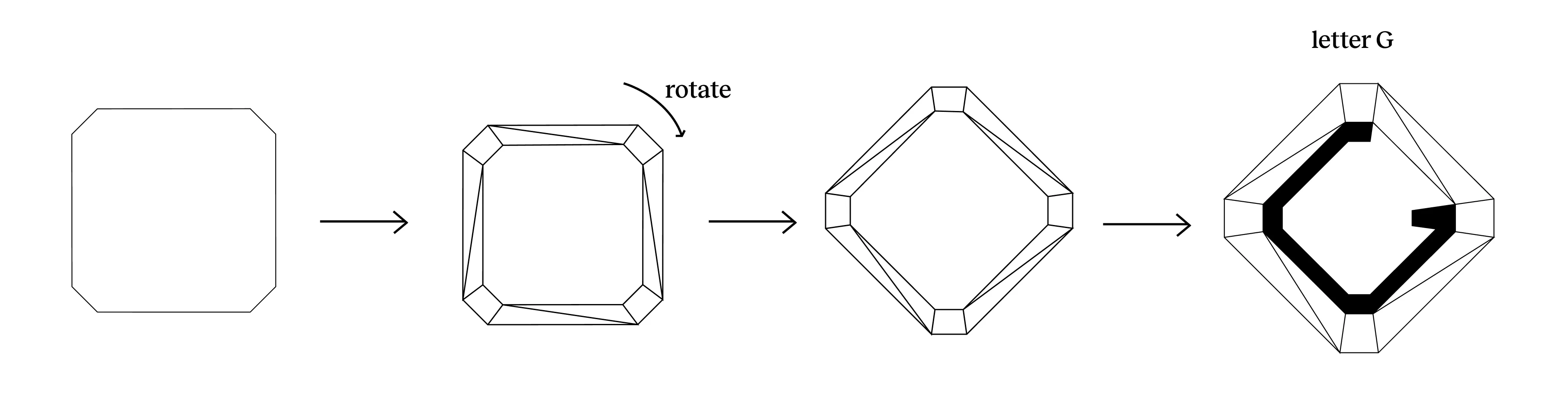
Letter G iteration
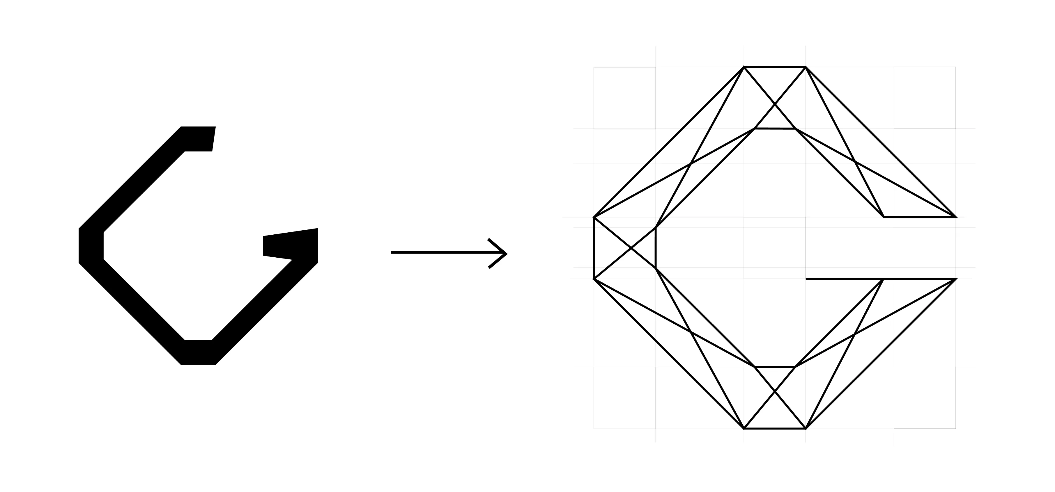
The Final Logo
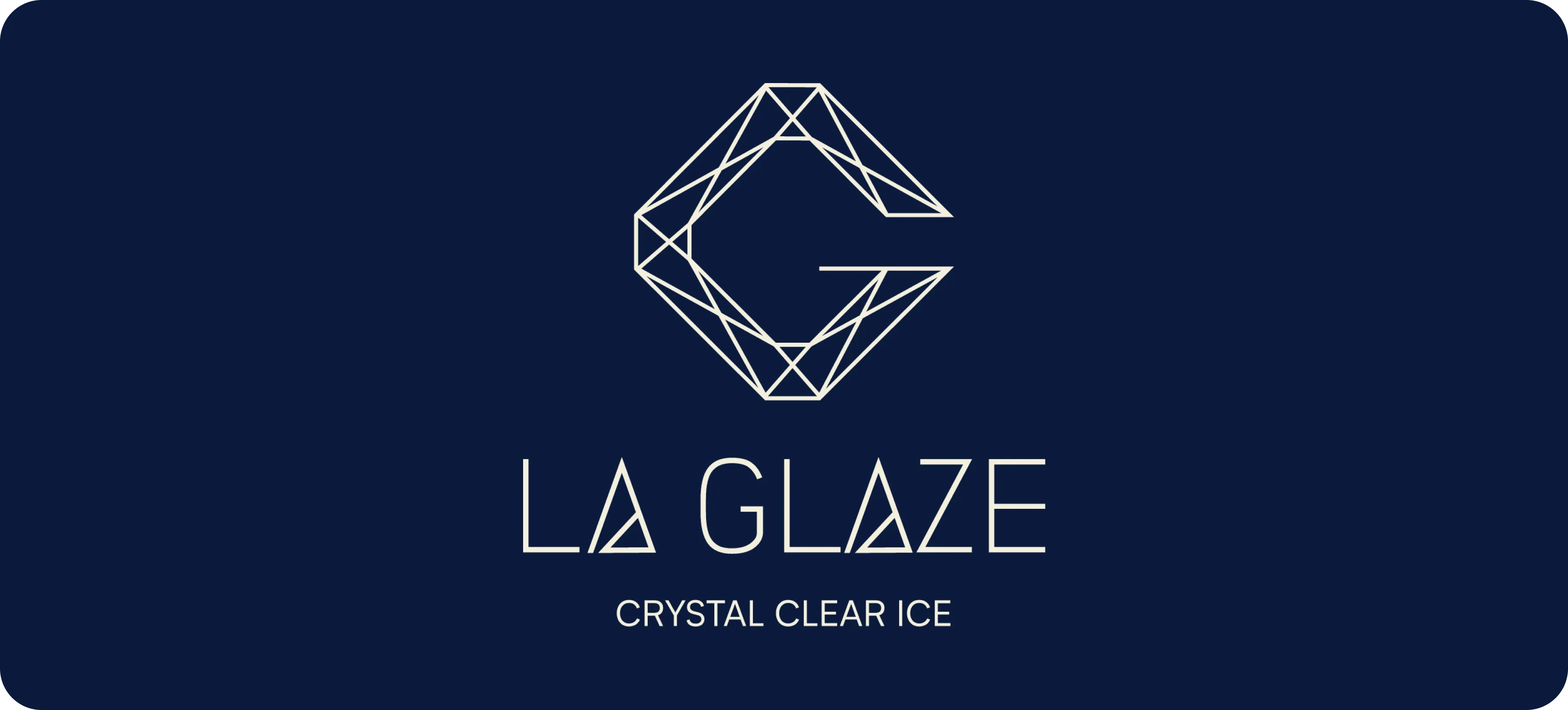
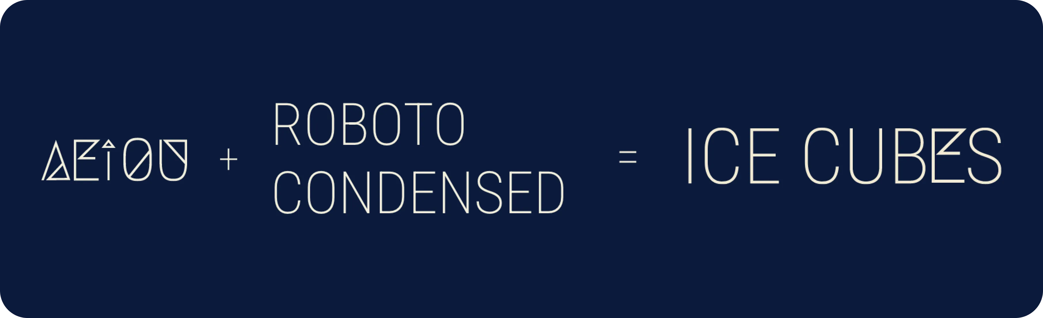
Typography
We created a custom typeface called La Gilaas, inspired by crystalline shapes, to give the brand a distinctive, sophisticated, and unique identity.
Custom Vowel Set
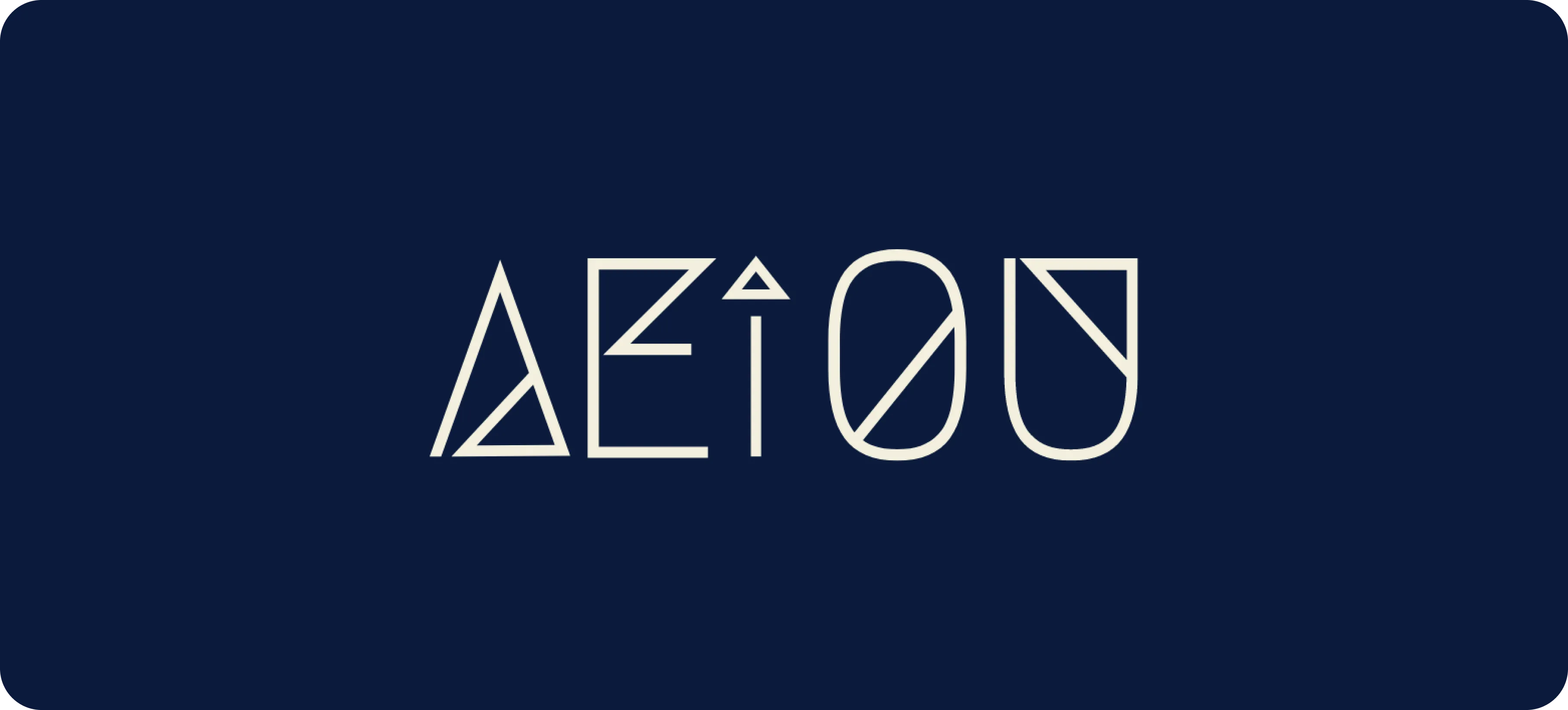
La Gilaas
Combining the customised vowel set with Roboto Condensed font to create a unique font- La Gilaas
Color Palette
The LaGlaze color palette is a soothing deep blue palette that represents opulence and growth. It signifies eliteness, elegance and royalty.
Oxford Blue
Violet Blue
Columbia Blue
Asian Pear
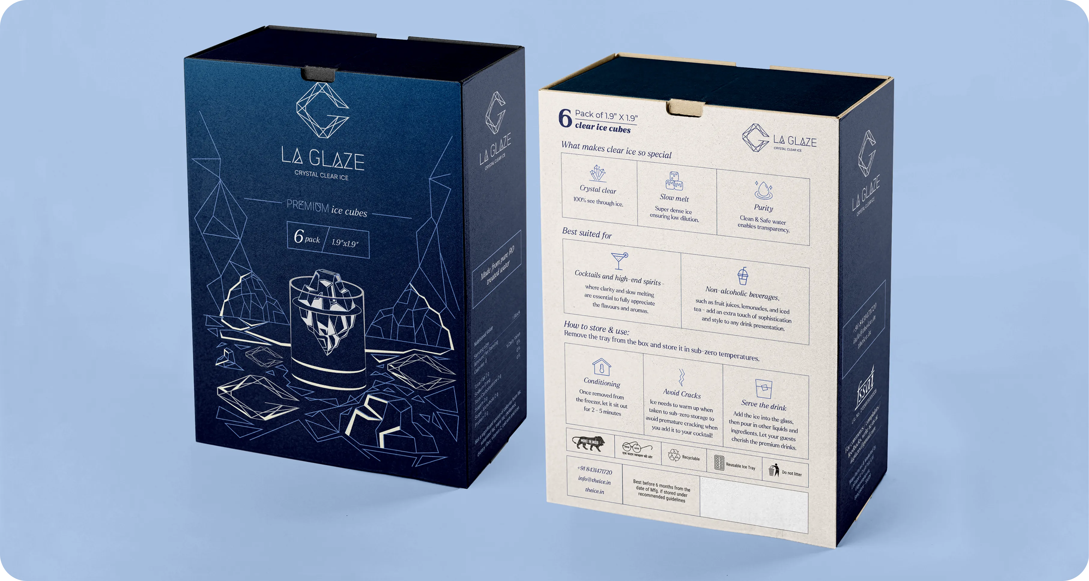
Packaging Design
Objective
Crafting a visual representation that evokes the sensation of our ice originating directly from the glaciers
Capturing the essence of pristine icebergs in every cube
Inspiration
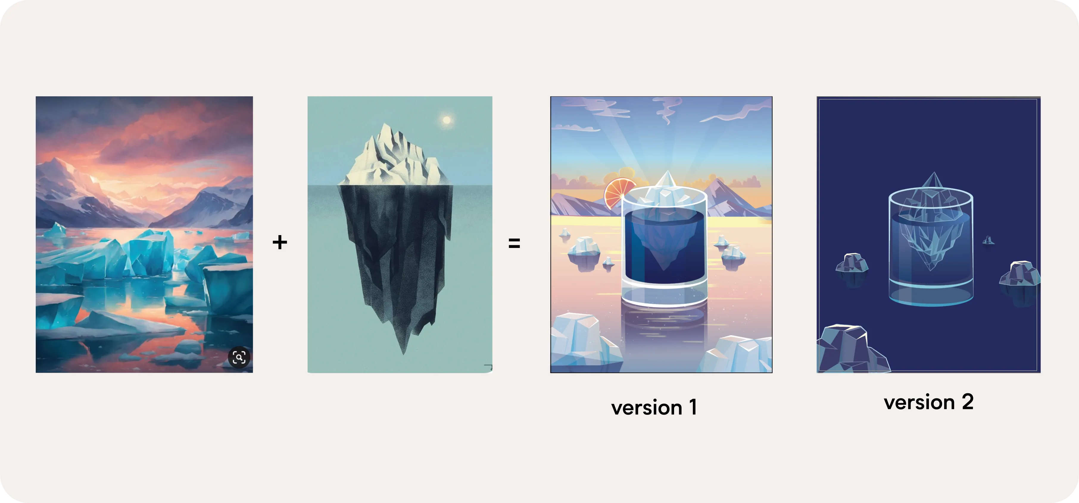
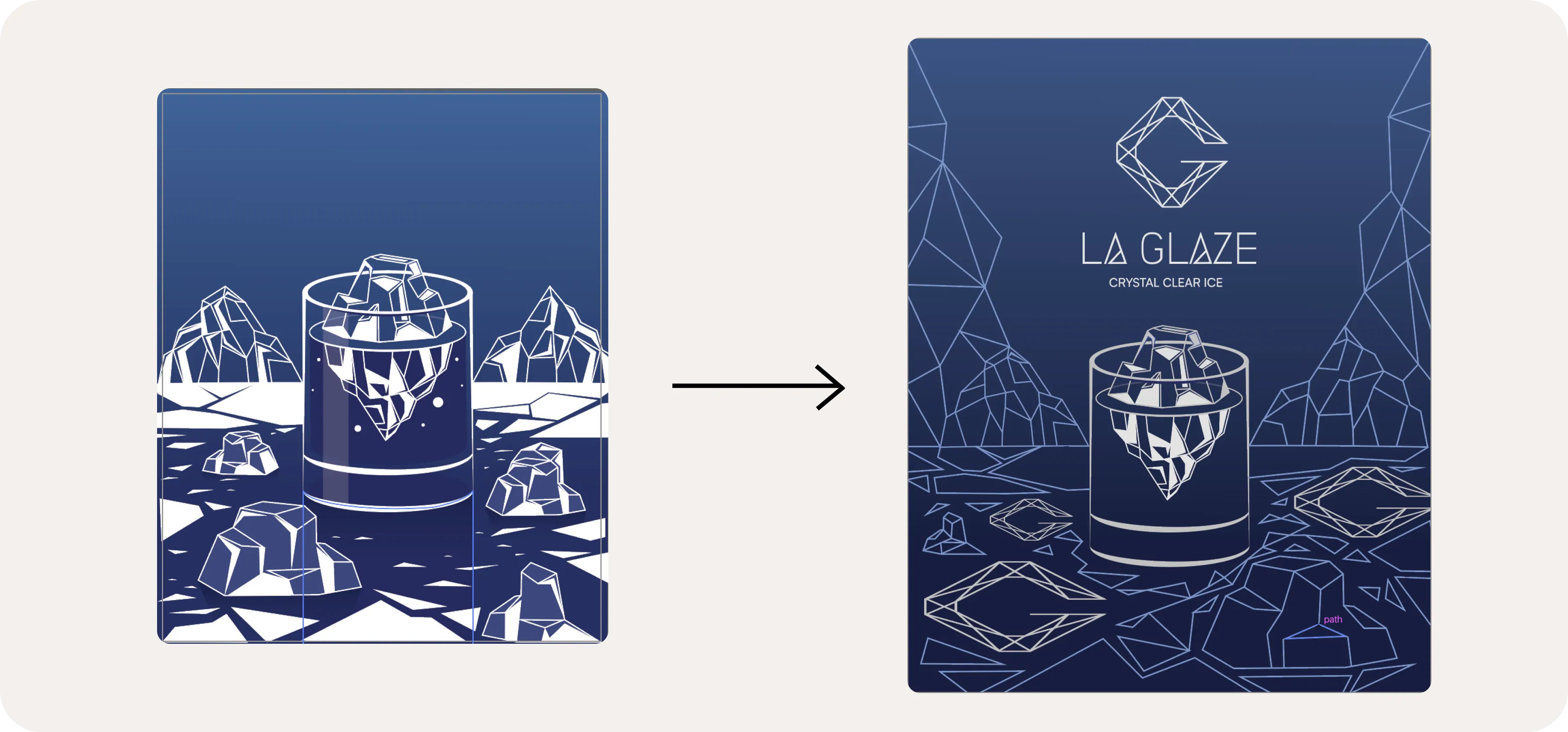
The Final Packaging Design
Brand Visualization