Redesigning the COS
application for Federal Bank
We revamped the COS app interface for credit card applying process, tailoring unique journeys for both existing and new customers. Within these journeys, we crafted multiple pathways to streamline onboarding while enhancing visual appeal.
The mission at hand
Outdated design
The design was outdated and the UI experience lacked vibrancy and appeal. Contributing to a dull and uninspiring user experience. Users find it un-engaging and uninteresting to interact with such interfaces.
Not mobile optimised
The interface was not well-suited for mobile devices, making navigation difficult. Additionally, the overall user experience on mobile lacks polish, with features that are not optimized for smaller screens. This led to inconvenience for users who primarily access the platform through their smartphones.
Cognitive load
Users encountered challenges with cognitive load, especially within the domain of personal banking. The complexity of tasks and the design of banking platforms contributed to feelings of overwhelm and frustration among users with the increased number of input fields with excessive and unorganised information on a single screen.
Poor UX
Customers were dealing with an outdated experience characterized by subpar user interface and user experience across various touchpoints. This includes everything from cumbersome navigation to lifeless visual design, resulting in high drop rate and dissatisfaction among users
The old design
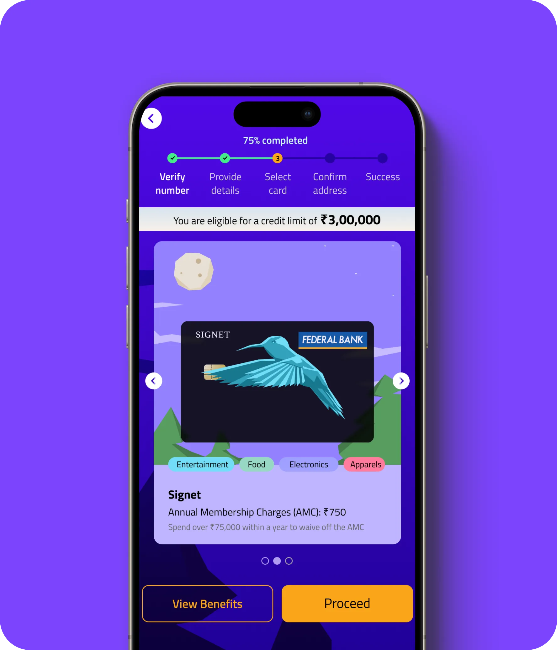
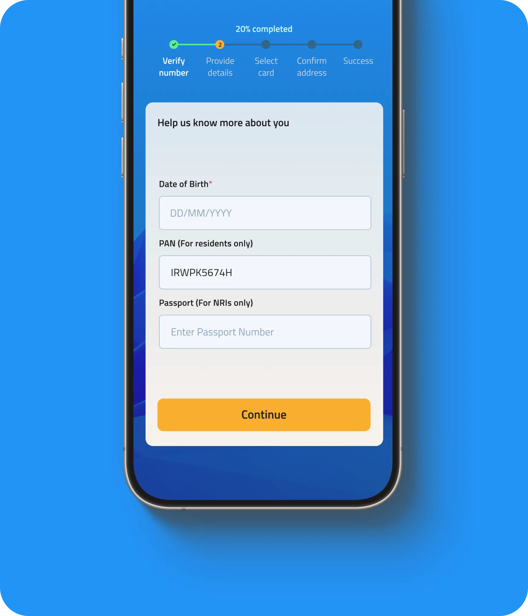
The Solution
Modern & distinct UI
Revamping the design with creative and modern elements breathed new life into the UI, enhancing user experience with greater engagement and visual appeal. Integrating animal imagery from the credit card design into the overall theme, we added subtle mp4ements that enriched the experience without causing distractions, ultimately making it more enjoyable for users.
Mobile & web optimisation
We optimized the interface for all screens, ensuring easier navigation and improved content accessibility. Implementing responsive design principles, we ensured a seamless experience across mobile devices.
User friendly experience
We focused on simplifying interfaces by minimizing the number of steps per screen and incorporating a timeline to demonstrate the straightforwardness of the credit card application process. We also implemented user-friendly error screens that make it easy and enjoyable for users to understand and address any issues. These efforts were pivotal in reducing cognitive load and enhancing the overall user experience.
The new design
Before