DrinkPrime is a smart water purifier available on subscription. The IoT-enabled water purifier in sync with the DrinkPrime mobile app allows you to access safe drinking water always.
The mission at hand
Restrictive brand language
DrinkPrime initially constrained its branding and color scheme to blue hues but sought expansion beyond water purifiers to encompass diverse industrial appliances, necessitating a versatile and inclusive palette to accommodate this broader scope.
Lacking brand identity
DrinkPrime lacked a distinct identity, brand guidelines, tone, and personality, resulting in a lack of brand recall and recognition.
Logo not scalable
Complex logos with numerous details can suffer from scalability issues, leading to loss of detail, legibility problems, and cluttered appearance when scaled down.
The new identity design
The new Drink Prime design system brings together two very core brand traits : value and simplicity.
The new visual world of Drink Prime allows us to establish the brand values and tell the brand story to the world.
The new system gives the brand a unique visual identity and also allows the brand to express itself effectively through its distinguishable shapes and patterns.
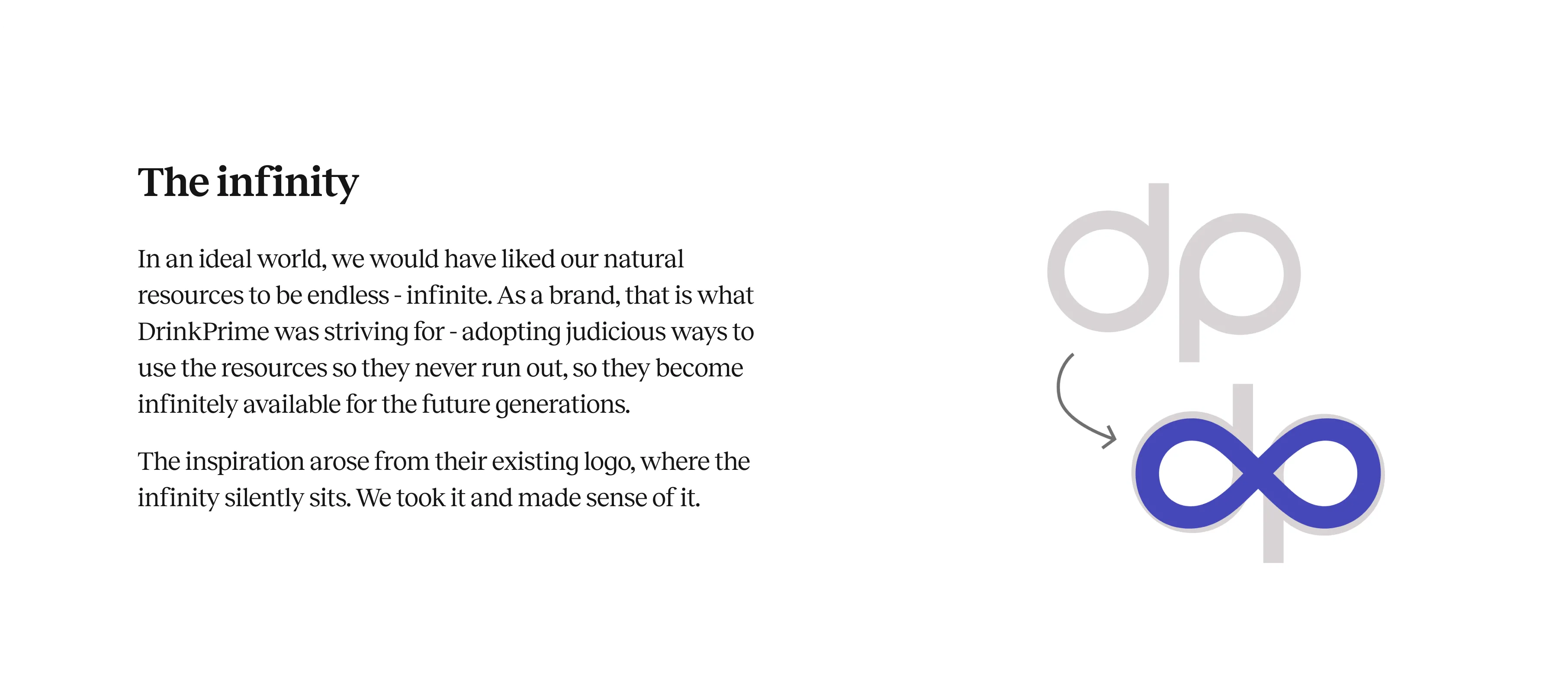
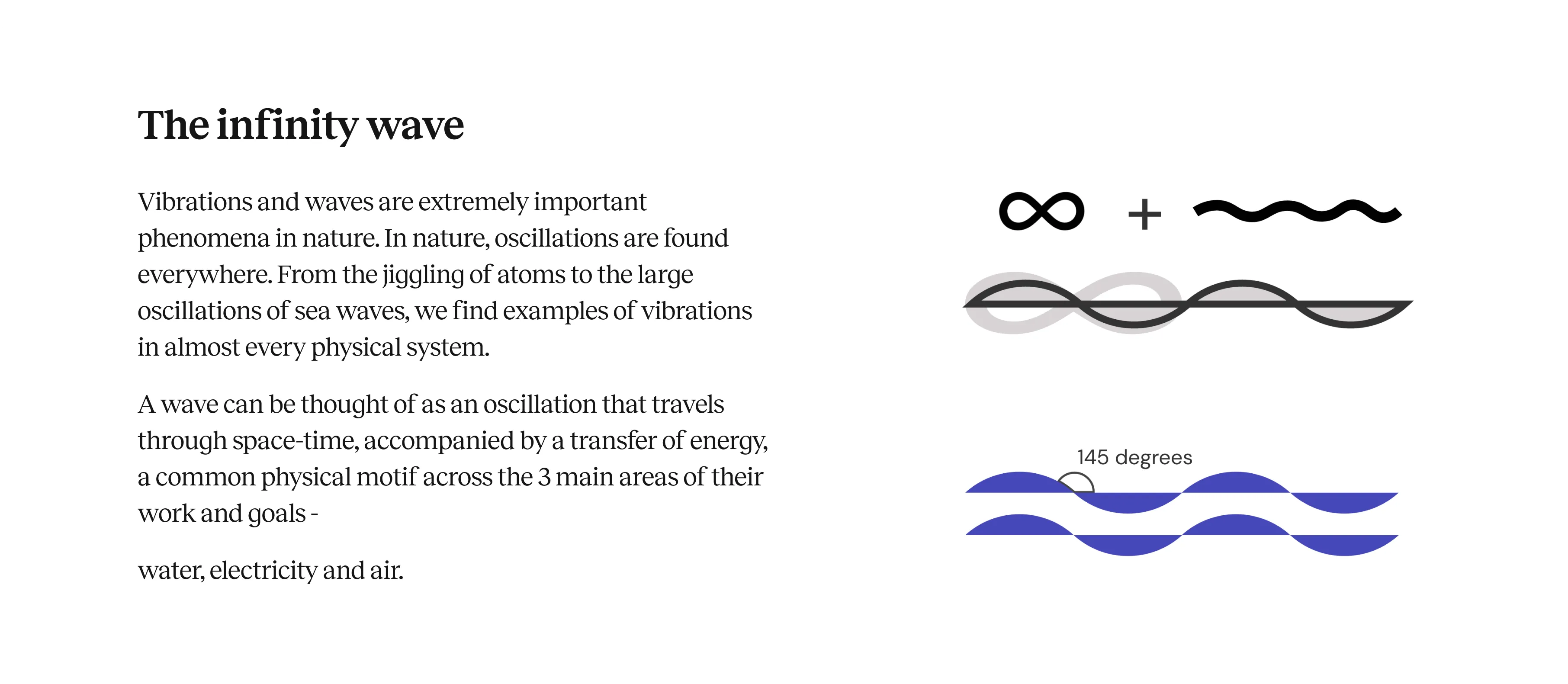
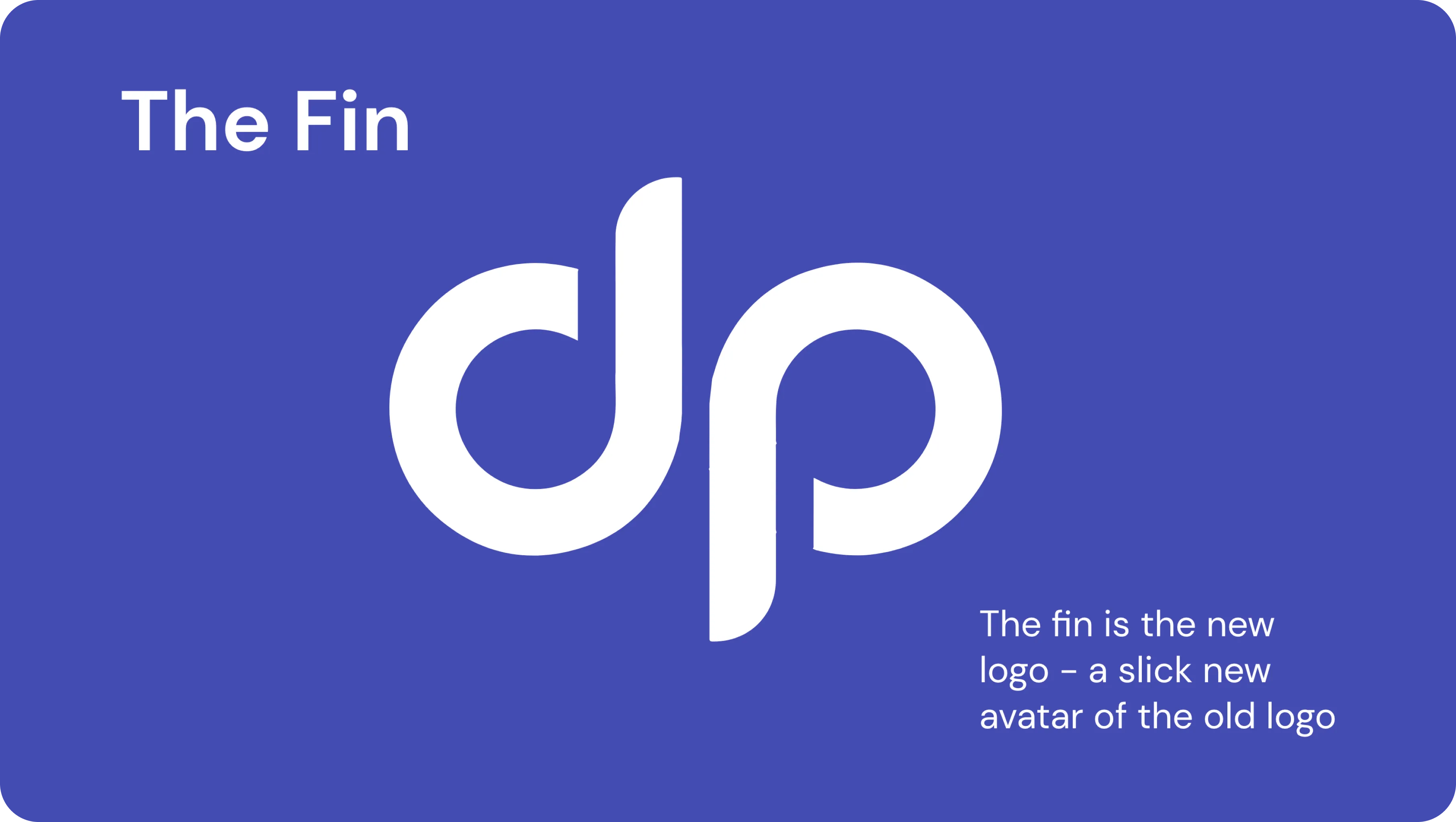
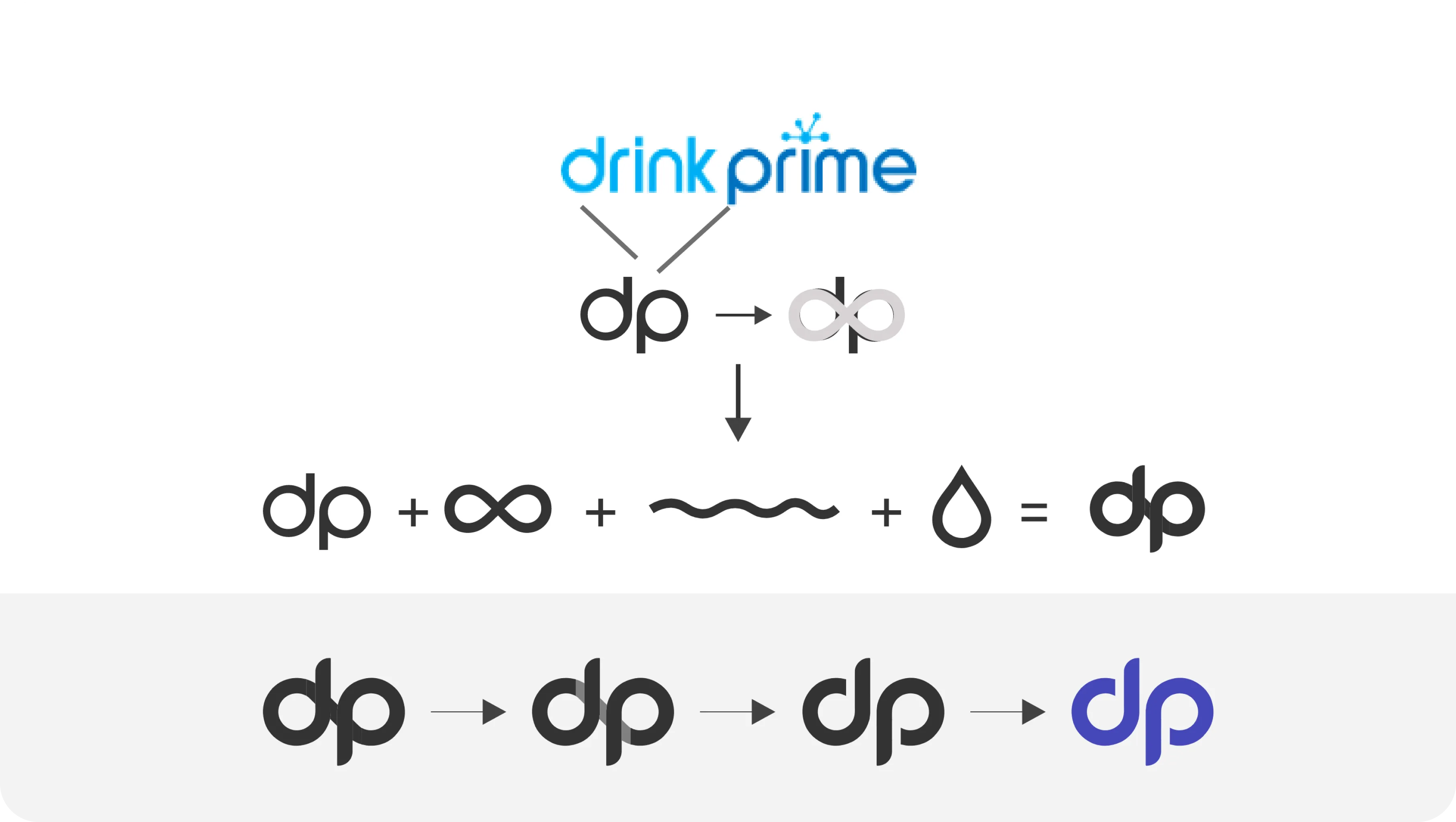
How did the Fin come by?

Logo Evolution
